Ta-Wei Lin, a member of PLDA, is a MA of interior design (Pratt Institute) and an international lighting designer who has won IALD Award of Excellence and IIDA Award of Merit. Lin is now the principal of CMA Lighting Design, mostly focusing on lighting projects in Taiwan. In 2012, he won IESNA Illumination Award by his lighting design, Giant Bicycle Headquarters in Taichung, Taiwan. We are very honored to have such a chance to interview Mr. Lin on his award-winning project.

-

-
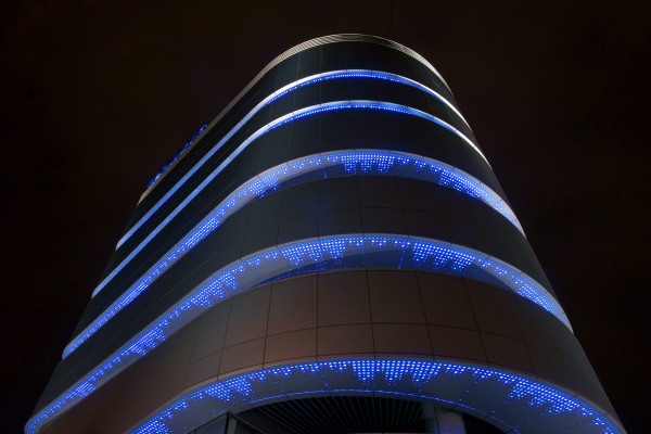
Giant Headquarters in Taichung, Taiwan.
Coming up with the main idea
Ta-wei Lin is a respected lighting designer locally and internationally. His lighting project, Giant Bicycle Headquarters, won him an international award. We are curious about the concept behind it, and we are elated that we have such a chance to interview Mr. Lin about this project. At the beginning, Lin told us that he didn’t have any idea for this building; the first thing came into his mind was that he wanted to do something different. “If I regarded this project as an ordinary one, I would definitely follow a traditional way, that is, to design the lighting effects on the façade,” noted Lin.
This building is Giant’s headquarters (Editor’s note: Giant is one of the leading bicycle manufacturers in Taiwan) and the architects designed it for cyclers to ride their bicycles up to the rooftop so they could take a shower and leave. However, the space is not wide enough so cyclers can only reach the second floor. Lin explained: “In this building, the first and second floors are for displaying; above are all for offices.”
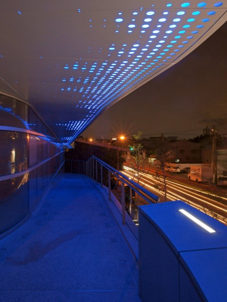
Because of the special structure, Lin felt that it would be a little dull if he had designed it in a traditional way. The very exceptional idea he came up with was “animation” – not the Japanese animation, but “being animated” by interactions between cyclers and this construction. “This is not done by any controlling system, but by motions carried by people.”Lin emphasized. To achieve this, the most important thing is to think how people can interact with this building. First, it is necessary to understand the perspectives on this building and the most interesting part of this building is its “cut-out” balconies – it is as deep as two meters for it is originally designed as cycle path. Lin said about this structure that: “This is very unique. So, we decided to express the motion and speed of cycling without adopting any controlling system.” The process Lin took was started from regarding the building as a sculpture, and considered the ways people interact with it; until then they began designing. That is to say, they didn’t do lighting design until all these efforts got done.
Holes – the unique style
Lin showed us some photos of a museum in San Francisco. We can see that there are perforated metal with different sizes on the façade so it is vivid under the sunshine. “There are some other lighting effects done by controlling system, but that is not what we want. We chose perforated metal because you can interact with the building, that is, there will be different shadows according to where you stand. ” Lin explained his basic idea and took a mock-up out. This is a mock-up to present his idea to the architects and his client, Giant.
-

-
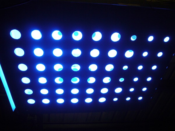
The mock-up of those illuminating holes with blue LED light.
-

-
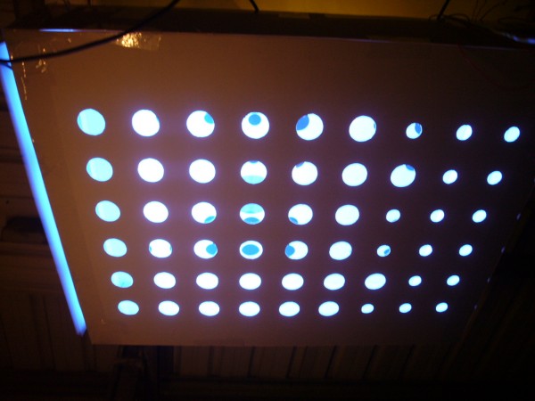
The mock-up.
Although it looks very animated as if there were countless jumping dots in the box, there are only black dots with different sizes inside. Surprisingly, they are SIMPLY DOTS. “When you look inside from different angles, you can see different gradations and effects.” Lin demonstrated how it works – from different points of view, you can see different effects.
The depth of the real lighting box is about 20 centimeters and there are only three patterns of the metal boards. In fact, Lin wanted to create as many patters as possible so the ceiling can present a show like shooting stars falling. But this imagination met some limitation. Due to the fact that manufacturers hoped to systemize and a budget concern, there are only three patterns. Nonetheless, cyclers are still able to interact with the ceiling as if it were talking to them when they ride their bicycles on the balconies.
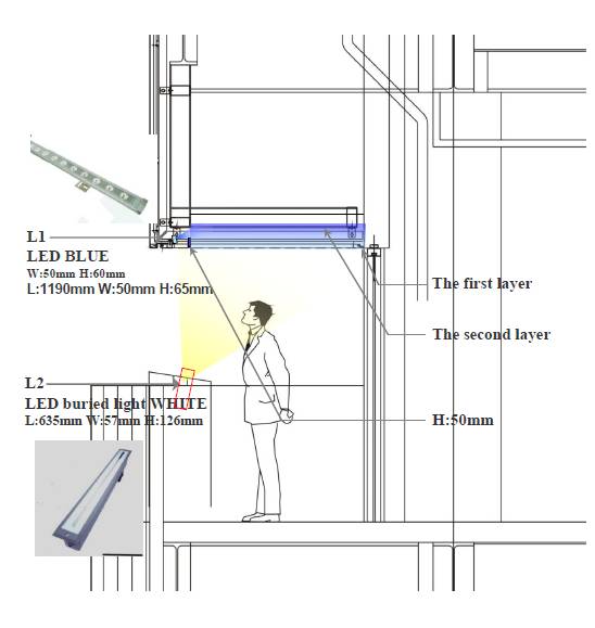
Lin noted that before the construction started, they had made a 1:1 mock up for testing but found that when it turns into night, the black dots would disappear because it is too dark outside. To tackle this problem, they install a 4000k white strip light and project it upward to make the box brighter for people can realize the differences brought by those black dots.
-

-
In order to make the holes brighter, Lin installed a white light LED projecting upward.
Randomness
On those patterns, Lin noted that there are only three types, both the outer allumium boards and the inner dots-boards. He did neither any arrangement nor design for all those holes' and spots' size and distance. Only corners and wider places were being attached on patterns with more holes and dots to enrich the visual diversity. “Randomness is exactly the main point for me to show this effect – when cyclers ride on the balconies, they can interact with the ceiling, and there is no anywhere the same.” Lin explained.
During the night, the ceiling becomes even more beautiful because all the shining blue dots reflect on the office windows. Moreover, the blue light doesn't intervene with the light in offices while show the lighting effects even better. Since there is no any lighting control, the light color itself doesn’t change but shows visual differences when you look at them from different positions.
Another special design is that on both side of the bicycle route on the balconies, the light fixtures are designed to turn on automatically when a bicycle approaches. This is to avoid bicycles crashing. It is not difficult to know how well Lin knows cycling culture.

Next: Interview with Ta-Wei Lin on Giant Bicycle Headquarters – Interacting with a vivid building, Making LED not to be like LED (2/2)


