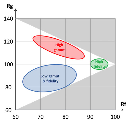
As we know by now, Rf describes color fidelity – in other words, whether colors are the same as natural colors. Rg, on the other hand, describes whether colors are, on average, under-saturated (low gamut) or over-saturated (high gamut). And of course, there is a trade-off between Rf and Rg: if we decide to make a light source that over-saturates a given color (thus increasing Rg), the corresponding color distortion also lowers Rf.
Since all this may sound a bit theoretical, let’s illustrate this.
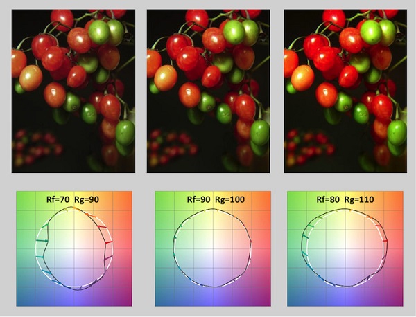
On the figure above, we compare three light sources. The center source has a very high Rf (>90) and therefore induces little color distortion: accordingly, the TM-30 icon shows very short arrows (remember – these arrows indicate how and where colors are distorted). The source on the right makes green and red colors more saturated – as seen both on the picture and on the TM-30 color icon (whose arrows point outward, towards “more saturation”); its gamut index Rg increases, but its fidelity index Rf decreases due to color distortion. Conversely, the source on the right desaturates greens and reds, and has low values of Rf and Rg.
Now look at the pictures and ask yourself – which ones do you prefer? When asked that type of question in a side-by-side scientific study, many participants would rank the source on the left the lowest and the source on the right the highest. In other words, the most “preferred” source isn’t the one with the highest Rf value, but the one with the highest Rg value. Hence, the use of the word enhancing for sources with a value of Rg above 100.
When should we use such color-enhancing sources? This is an intriguing question that doesn’t have a simple answer. First, we need to realize that just because something is “preferred” in a side-by-side experiment that doesn’t always make it better. Here, I will steal an analogy from an esteemed colleague: when served two otherwise-identical dishes, one of that has more salt than the other, most people favor the saltier dish. Surely, however, we don’t conclude from this that more salt in our food is always better!
Rather, we like to spice up our dishes with consideration – and the same is true for colors. In some cases, color fidelity is most desirable – for instance if we want to sell a product and present it as it will appear under natural light (think about food, clothes, make-up…). In other cases, color enhancement may be suitable – think of a restaurant where the colors of dishes should look deep and rich, or a lounge bar with a warm light that makes skins more tanned… In short, the answer depends very much on the application – and also on the artistic taste of the lighting user.
I should mention here that the concept of color enhancement, and color-gamut metrics, is not new, and predates the TM-30 work by decades. However, as we will see, the accurate guidance from TM-30 is especially insightful for applications.
Now that we understand the basics of color enhancement, the next question is: how do we, in practice, design a good color-enhancing source? We’ll look at this in next post.
And for those of you who will be attending LIGHTFAIR in San Diego – come by the Soraa booth (#2631) to say ‘Hello’ to the team and see Enhance, our color enhancing SNAP.


 CN
TW
EN


