Author: CC Hwang, Art Director of BeLight.com
There is a Chinese proverb expresses: "Anyone who has been to Silver Cave would never short of money" and Silver Cave is a national AAAA scenic spot in Guilin, China. 20 years ago, I had been here once when I didn’t possess any knowledge about lighting. I remembered that I couldn’t appreciate the beautiful karst landscape at all as the over-colorful lighting kept distracting me. There were several scenic areas in the Silver Cave and each was assigned with different name and story according to its shape and people’s imagination. I was totally overwhelmed by the overly-elaborated stories and the overly-lit colorful stones.
However, I decided to give it a second chance. Luckily, the second experience was far better than the first one even there are still a lot to be improved. Lighting does play a very important role in this specific scenic spot; it lives by light, dies by light. This cave is like a stage for a stage lighting designer – there is no natural light, and there are thousands ways to illuminate it! Different karst rocks are like different stage settings. In order to create a harmonious picture, the lighting needs to be considered from various aspects. Here are some thoughts I would like to share while revisiting the Silver Cave:
-
Color
-
Color Contrast
-
Color Harmony
-
Focus
Color
Using colored light can make a space more interesting. But which color and WHY this color? Does the color have connection with the story? One has to be very careful when it comes to the choice of color, otherwise the wrong combinations of colors can destroy the beauty of the nature.
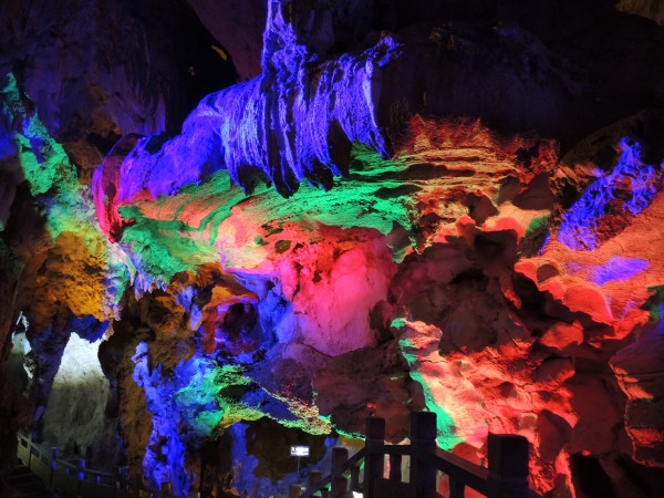
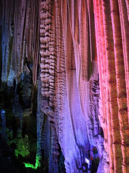
Take Image 1 as an example, the colorful lighting represents a flashy image like peacock’s long tail but there is no any reason of doing this. It seems to me that the colors were just randomly chosen and positioned. You can find the rock does resemble in peacocks if you look at it closely. If the lighting can be used more carefully with the aid of theatrical technique such as GOBO, the image could be more appealing.
-

-
Image1
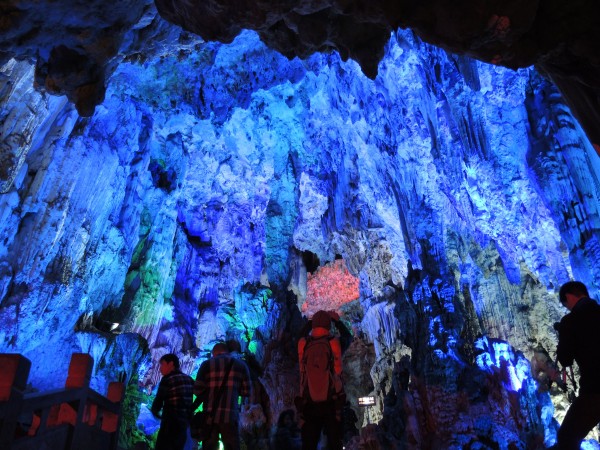
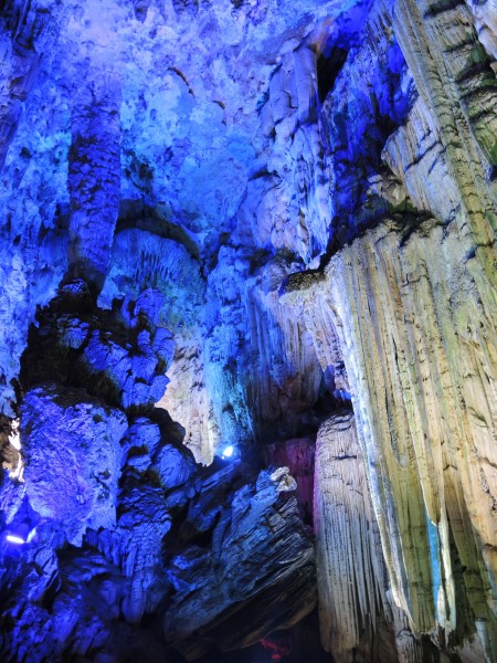
There was another scenic area called “Ice world in southern China.” I personally think that the light successfully create an ice world adopting different intensity of blue light. (see image 2, 3) White light is applied at some corners to mimic snow and coldness.
-

-
Image2
-

-
Image 3
Color contrast
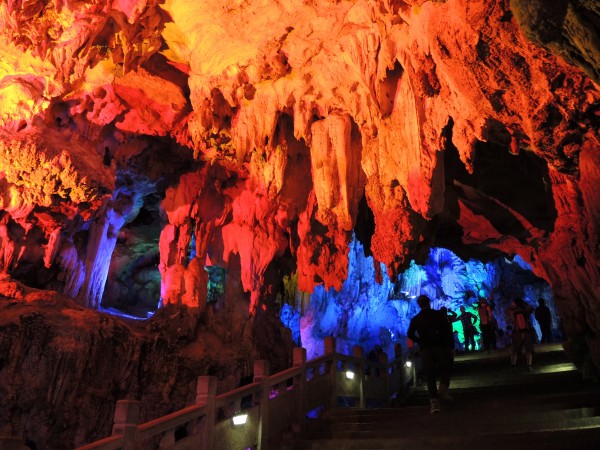
Image 4: This is a good example of using colored light to create contrast. The warm light was placed in the foreground and the cool blue light was arranged in the background. This created an interesting contrast. In the color theory, warm colors have an "advancing" effect, appearing closer than they are. Cool colors, by contrast, have a "receding" effect. Visually they move away from the viewer and disappear into the background.
-

-
Image 4
Color Harmony
It has been suggested that "Colors seen together to produce a pleasing affective response are said to be in harmony." Color combinations which can be found in the big nature are harmonious and appealing to our eyes. We can learn a lot from it. (reference:Let’s start from observing )
In Image 5, the colors seem pleasing. Does it reminds you with the sky when the sun setting?
-

-
Image 5
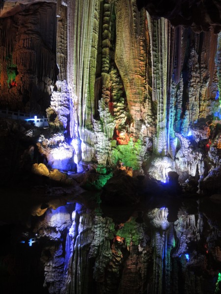
It is an area called “Jade pool Wonderland” in image 6. The lighting is unfortunately not pleasing, and it is also a bit too glary. It is such a waste as this area is very special comparing to other areas -- there is a pond which can show the reflection of the rock above and generate a symmetrical image. If the lighting can be conducted more thoughtfully, this would be more stunning!
-

-
Image 6
Focus
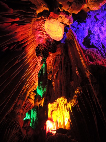
Light can create a visual focal point as well as guide our eyes to the wanted information. Sometimes it can be a linear element, and sometimes it can be the brightest area in the picture. Take image 7 for example, the focal point should be the oval plate on the top as all the linear lines of the rock pointing toward it. However, the brightest area is obviously not the oval plate which weakens the image.
-

-
Image 7
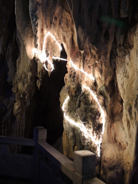
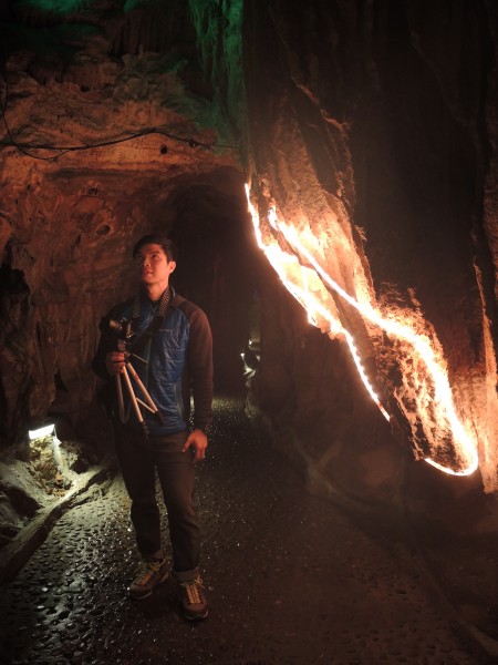
The Pathway lighting is equally important because it provides safety for visitors without distracting them when they appreciate the karst landscape. The authority of Silver Cave adopted tube light in some areas but they are not being carefully placed on the rock so they form irregular shapes which have nothing to do with the original shapes of the rock. For the light shines on the visitors, it was good. But the shapes they create on the rock are not attractive at all. (see image 8 and 9)
-

-
Image 8
-

-
Image 9


