previous article: Interview with Ta-Wei Lin on Giant Bicycle Headquarters – Interacting with a vivid building, Making LED not to be like LED (1/2)
Ta-wei Lin, a member of PLDA, is a MA of interior design (Pratt Institute) and an international lighting designer who has won IALD Award of Excellence and IIDA Award of Merit. Lin is now the principal of CMA Lighting Design, mostly focusing on lighting projects in Taiwan.
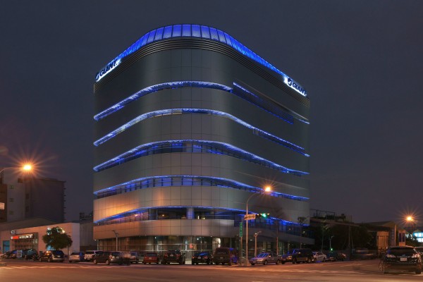
Lighting it up from “cut-out”
Other than those balconies, Lin and his colleagues used LED light pole to gently wash the exterior wall. The rooftop of this building is also perforated metal, and there is a gap between the rooftop and the wall for the staffs to install some LED fixtures to wash the topper part. Lin got rid of the old concept of projecting light on the façade; instead, their efforts were all about to light up this construction from its “cut-out.”
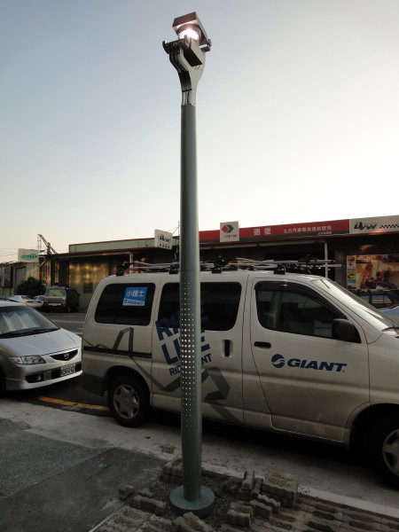
There is another way to highlight the exterior – light poles. To make all the light poles and the building a pair, Lin redesigned the light pole following the “hole style” – there are also holes on the pole, and there is a strip LED light inside to highlight the pole. Additionally, the poles’ color are also painted in the same color with the building itself.
When installing all those lighting fixtures, they faced some problems. Initially, Giant preferred adopting white light but Lin knew that the CRI of white light is too good for us to use because it would expose every blemish. “I think the reason was that they were worried about the brightness. And, if we used blue light only, the atmosphere might be a little gruesome. But as you can see, it works pretty well!” Lin said.
-
-
There are holes on light poles as well. Additionally, the color of light poles is the same with the building.
Besides, the architects proactively notice the glare problem and insert shields to prevent glare and those shields cover light of the first array. Although it is usually necessary to use plates to prevent glares, Lin said that all the lamps inside are tilted upward so staffs in the office won't be affected by glare. This indicates that it is not necessary to install any shields for there is already an angle to prevent glare. Lin and his colleagues realized this problem after plates were all installed and would cost a lot to get rid of them all. Therefore, Lin decided to start his lighting magic from the second array.
Another incident was that the contractors tried to align all those holes on both the aluminum patterns and the boards with black spots. However, as they were designed to show the special effects through disagreements between holes and dots, once they were aligned perfectly, it would become difficult to realize the differences made by those spots. “We told the workers don't try to align them immediately. We don't have any controlling system and we need the disagreements for my idea to pop out.”
Expression of a specific culture
We have mentioned that Giant initially preferred using white light rather than the blue light Lin adopted and there was a very good reason for Giant to accept Lin's suggestion – Giant’s brand color is naturally blue. Additionally, the round-shape holes come from Giant’s round logo. In a nutshell, “what we do is to shape Giant’s night image. Therefore, Giant accepted our concept while the architects also admitted that this concept can be suitable to this building,” Lin explained. “We had a 'perfect condition.'”
All lighting fixtures they used are LEDs, but LEDs are not always the best choice. Lin noted that LEDs are typically too bright. They are so bright that sometimes people can only witness the light but the building itself. Lin said that he have told Mr. Mende (Editor’s note: Kaoru Mende, an international lighting designer from Japan) that good LEDs exactly add work loading for lighting designers. The reason is that, in order to figure out what is the best lighting method, designers have to do more tests even they have a very simple idea. “We are now trying to find out some method to make LEDs not to be like LEDs.” Lin emphasized.
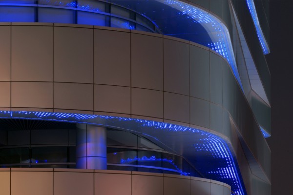
When it comes to lighting design, Lin said the most important thing is not how they come up with any idea, how they fix it or how they use all those lighting fixtures. The point is how to reveal something. In fact, lighting design is all about representing an company culture. “In this case, the main issue is exactly to represent Giant’s identity. If we design lighting under such a concept, the most difficult aspect is to understand the enterprise’s culture correctly, and then figure out some way that can show this culture perfectly,” Lin noted with a smile. “This is not only about using lighting fixtures. Therefore, capturing an enterprise’s culture is always time consuming. After we grabbed the culture, the cultural concept became our central concept and we have to work around it. When we have more than one project, it is out of question that we always choose the one which can represent the culture best. This is what we lighting designers do.”
This is an era that lots of people do lighting design including lighting fixture manufacturers. In terms of hardware and technology, designers may be not as good as LED manufacturers. The LED manufactures regard lighting as a branch of electronics industry; however, such a concept is totally different from perspectives of lighting designers or architects. Those manufacturers emphasize lighting effects. In contrast with that, “I think it is more important to understand and integrate cultures.” Lin noted on the main issue.
Products photo
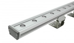 LED fixtures installed in the box
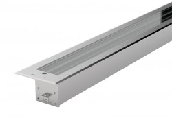 The lamp projecting light onto the ceiling


 LED fixtures installed in the box
 The lamp projecting light onto the ceiling


