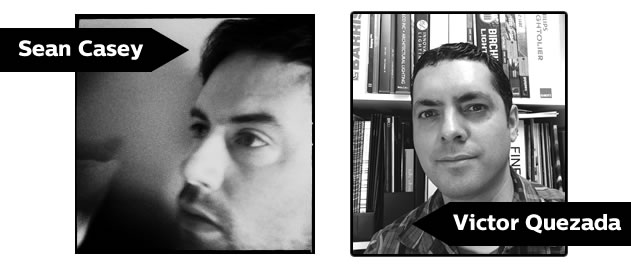
Sabrina-Santoro of Philips Lumec speaks to Victor Quezada and Sean Casey, Principals from render light & planning, inc. about the process of coming up with design for The Exchange tower in Vancouver, Canada.
Vancouver, BC, one of the world’s most liveable cities, is generating attention for an ambitious project that is being designed as a collaborative effort between Harry Gugger Studio in Basel, Switzerland and Vancouver-based Iredale Group Architecture. The new tower, known as The Exchange, will be a juxtaposition of traditional heritage and innovative modern technology. Developers Credit Suisse and SwissReal broke ground on The Exchange tower in January 2014, and it is set for completion late in 2016. With the long lead time on this project, a 3000 sq ft showcase Exchange Presentation Centre opened in June 2013 across the street from the construction site for prospective tenants to get a glimpse at what they will see once The Exchange is completed.
Victor Quezada and Sean Casey, Principals from render light & planning, inc. were brought in as the speciality lighting consultants on the project and are responsible for lighting all the front of house areas, the lobbies, the landscape, the architectural façade, as well as all the office space. In addition, Victor and Sean designed and implemented the lighting for the Presentation Centre, which features a Custom Recessed Linear System designed by Philips Ledalite. In speaking with them about The Exchange tower and the Exchange Presentation Centre, it is clear that this is so much more than just a building – it’s about raising the bar in what is possible and expanding our limits.
Can each of you describe your role at render light & planning?
Victor: As the Light Principal I come up with the lighting concepts and run all the lighting analysis and modeling before I pass it over to Sean.
Sean: My background is in interior design and when I started working with Victor I knew next to nothing about lighting, so it’s been a learning experience for me. As the Planning Principal, I usually approach a project from an interior design perspective, integrating the lighting concept into the interior concept and then preparing the tender construction working drawings. Once the technical documentation, simulations, and working drawings are complete, we pass these assets onto the contractors and designers for realization.
Where do your roles cross over?
Victor: When we’re working in schematic design usually one of us will have a breakthrough, or epiphany, pushing a particular design forward. It’s through this process where we work with a lot synergy. Every project is different – ranging from straightforward details to more complex requirements, such as The Exchange tower. It’s a collaborative process in the beginning and then we’re always working in parallel, so while Sean’s creating the design drawings, I’ll work on the schedule, the cut sheets and the technical part of our scope.
Sean: A lot of conversations start with “Wouldn’t it be cool if…” and then things progress from there. We sit really close to one another so we are constantly bouncing ideas off of each other.
Victor: Our approach is that the lighting is first and foremost architectural, rather than putting light in a space that’s already conceptualized, and our process is to respect the architecture – giving it emphasis sometimes and other times de-emphasizing it. For us it’s very exciting when an architect asks our opinion and gives us a bit more creativity to influence his/her design. It’s a different approach and makes things more interesting for us.
What is the driving vision of The Exchange tower and the corresponding Presentation Centre?
Sean: It’s a very high-quality building with an innovative mechanical/electrical system inside it, but is still expressive of the commercial purpose. At the same time the project is respectful of the existing 1929 heritage building, which is being structurally integrated into the new tower. As a departure from what’s normally built in Vancouver, The Exchange tower is ambitious and exceeds the bare minimum, earning the first LEED Platinum certification for a heritage conversion in the city.
Victor: The Exchange Presentation Centre had to reflect the overall vision, so some of the systems were installed to demonstrate what they would look and feel like in The Exchange tower. A major component of the project is the Giacomini radiant heating and cooling ceiling system, which required us to incorporate lighting that is representative of the final product that will be installed in the tower. In some ways this was almost like reverse engineering – the concepts we developed became mock-ups, which then became reality when they were installed in the Presentation Centre.
 |
|
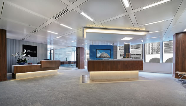
The Exchange Presentation Centre after the LED upgrade. |
A radiant heating and cooling ceiling system is a very unique feature. Can you elaborate on what it is and how it works?
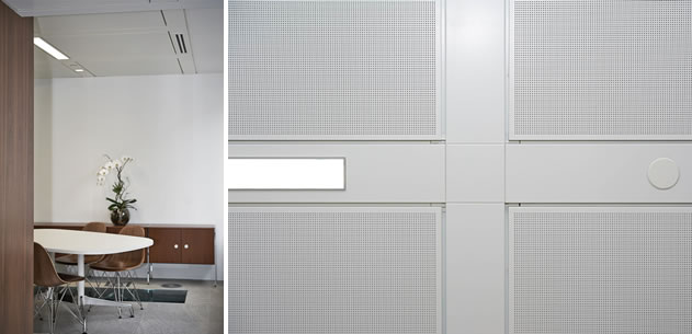
Sean: It’s essentially a metal ceiling system with a T-bar like structure and a perforated metal panel that sits in between the grid of the T-bar. The back of the metal panel is comprised of copper piping with flex connections, and inside the piping is water that can be heated and cooled. The metal panels thereby efficiently heat and cool the space radiantly, without forced air.
The specification for the Giacomini ceiling system came from the mechanical designers so we were faced with the challenge of what to do with lighting in a metal ceiling – whether suspend it or integrate directly into the ceiling.
In looking at the lighting requirements for the project, what did you have to consider in selecting Philips Ledalite luminaires?
Victor: One of the criteria when the ceiling was first proposed was to have lighting that can be situated on 10’x10’ centers. Thinking about what product that can be used to accomplish it, I immediately thought of Philips Ledalite and their Mesooptics technology. I did a quick analysis and put 54W T5HO fixtures on 10’ centers and liked what I saw. I spoke with the local lighting agent for Ledalite and he arranged a meeting at the factory to discuss the requirements of the project. When I took a look at the proposed product, I knew it was exactly what we needed! Through multiple meetings it was determined that the fixture could be stripped of things that aren’t necessary for the project, in order to keep the costs down but still provide the necessary performance. When the photometric files came in I was shocked that we were getting really low watts per square foot, while maintaining a 30 foot candle light level, and the first mock-up of the fixture exceeded my expectations for performance. At that point we had some fixtures made, however they sat in limbo for six months while we relocated the site for the Exchange Presentation Centre. After a few months of being installed, Ledalite presented us with the latest generation of the Custom Recessed Linear System, which has higher efficacy and better watts per square foot on the photometric files. The first generation of this fixture is sitting in our Presentation Centre, and at some point it will be swapped over for the most recent generation. Things are evolving day by day and we’re excited to see what’s finally going to be realized for the project.
Sean: I think that says a lot about the pace of change with LED. Because this is a large commercial project, it doesn’t get built or designed overnight and so much can change before the building is complete.
Victor: Something that we discovered is the Kelvin temperature for the product specified throughout the Exchange Presentation Centre, which is 4000K. People are shocked that we’re going with such a cool lamp temperature because they’re used to fluorescent 4100K, which is more on the blue side of the spectrum. The LED light produced by theCustom Recessed Linear System is more on the red side so we get a good R9 value for skin tones, making the lighting less harsh. It makes everything look nice and crisp, and that’s what we like about it! It’s very European inspired and forward thinking, which fits with the rest of the project methodology.
 |
|
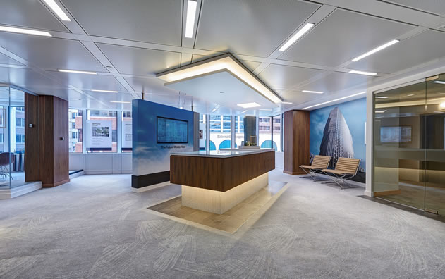
Another angle of theThe Exchange Presentation Centre. |
Can you describe your collaboration on The Exchange project?
Sean: In detailing the architectural façade and the lobbies we consulted Harry Gugger (the design architect) and for the landscape areas we worked with PWL (the landscape consultants). In addition, we collaborated closely with Giacomini to determine how we could get their ceiling system to accommodate our lighting. The panels were all pre-cut in Italy to very fine tolerances so that when the system showed up here and got installed, the lighting simply slid into it.
Victor: There was a lot of going back and forth with Giacomini on the spreadsheet to make sure that everything was correct – we’re talking millimeters. Everything had to be right the first time around or we’d have to wait six weeks for another panel to arrive.
 |
|
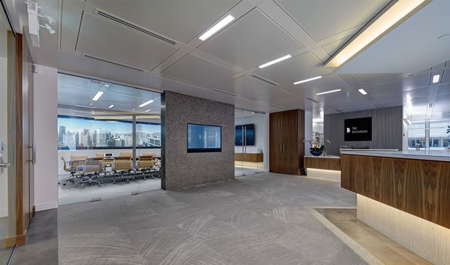
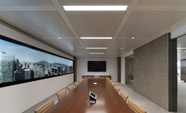
The presentation center and conference room. |
Was making the ceiling work the biggest challenge?
Victor: The local architects had everything down in concept but since this was the first time the Giacomini ceiling system was being used in Canada, there was a lot to consider. For the Exchange Presentation Centre the local developer hired an outside interior designer to design the space and we were retained to do the lighting design. The interior designer, who wasn’t familiar with the Giacomini ceiling system, asked us to create the ceiling plan. At that point the project became even more interesting for us as there was a lot of direct dialogue with Giacomini, and through this process we learned a lot about the ceiling system – how it works, how it’s going to be joined to drywall, and all the little parts and components. Since we were also doing creating the lighting plan, Sean came up with a panel matrix system where every panel has a number and a letter that corresponds with where a diffuser or light fixture is going. When the system finally arrived and they had the first panel up with the carrying elements for lighting we immediately ran over and put a light fixture in it to make sure it fit. That was our true test.
 |
|
A conference room at The Exchange tower. |
Sean: The Exchange Presentation Center had two purposes: it was created for potential tenants to preview what The Exchange tower would be like, but it also was a dry run for something that wasn’t totally tested at that point. It was a chance for a lot of people to learn how to work with the ceiling and install it – a proof of concept. Everyone has been very happy with the results!
Since the Presentation Centre was designed as a showcase space for The Exchange, what are the “stand out” features that prospective tenants and leasing agents should be aware of? How does it contribute to energy savings and sustainability efforts?
Sean: The building has a very, very small ceiling plenum of 8 inches, a raised floor plenum, a radiant heating/cooling ceiling system, a high-performance curtain wall, and a high-quality air circulation system that essentially pumps fresh air in from the outside. It’s not a sealed building where the air is recycled so the outstanding air quality is a huge aspect of the building.
Victor: To tie it all together is the energy efficiency throughout the building, which has earned a very large hydro rebate for the project. The overall energy is very low – approximately 40% under Ashrae standards – and it’s a LEED Platinum building, making The Exchange tower the most energy efficient building in Vancouver.
Something that is also very important for us is the light levels and how the human eye can be tricked in perceiving brightness. The Exchange Presentation Centre really makes you more aware of the environment and demonstrates that you can still have a well-lit space using 25 footcandles rather than 50 footcandles, which has to do with a wider perceived brightness from the fixture’s MesoOptics and batwing light distribution. Part of the concept for The Exchange Tower is that hydro is allowing tenants to use LED task lighting, so we will have to come up with a list of products that they’re allowed to use in the space.
Sean: Another important aspect of energy savings are the lighting controls for daylight harvesting. With the built in daylight response in the fixture it’s really about putting light where you want it, when you want it, and then having it off when it isn’t needed. The Exchange is a smart building that is responsive, making it highly efficient.
 |
|
Close up of the LED luminaires and design used (right). |
What has been the most interesting part of this collaboration up until this point?
Victor: The development of the lighting fixture for the past year and a half. During this time it’s gone from a mock-up to something that has exceeded our expectations, and keeps getting better. To have a company that was willing to take a leap of faith with us was also very exciting and we’ve enjoyed the collaboration with Ledalite. It’s been a lot of fun and we’re hoping this will set a precedent for the future of lighting.
What are you most excited about when you think about the final build of The Exchange?
Victor: The final product is going to be a component of the building as a whole. It’s a well-engineered, well-designed building and the lighting is one thing that fits into it perfectly. I’m eager to see how all the lighting will integrate into building and I think the look and performance will be astonishing. We don’t know what the final wattage of the fixtures will be, but it will only get better!
Sean: I’m excited to see what impact this project has on the construction of new commercial real-estate. I think this project is living proof that you don’t have to do the bare minimum – you can do something ambitious that makes sense commercially, is economically viable, and raises the bar. We’ve had quite a few meetings with other designers, engineers, developers and architects who have been enthused by what they’ve seen and have left with some excitement towards their own projects. I think this is a good sign of what’s to come.


