Soraa’s Chief Scientist Aurelien David explainsTM-30 color metrics in this latest blog entry.
In my last blog, I sketched a simplified landscape of color rendition and related metrics. In coming weeks, I’ll be discussing one which has been making some noise lately: the recently-published TM-30-15 from the IES. Today, I will first talk about the CRI and explain what TM-30 tries to accomplish.
A word of context first. The global authority on this topic is The International Commission on Illumination (CIE), which created the CRI among many other standards. The CIE produces solid work, but its procedures are slow: its technical committees have been working on updating the CRI, but this work has not converged yet despite decades of effort. In the meantime, the lighting industry has been relentlessly asking for something! Thus the IES created a smaller, swifter group (in which I was a lead technical contributor) to make a proposal – and this has resulted in TM-30.
TM-30 deals with the color rendition of object; more specifically, it compares the color of objects under a test source (say the LED bulb we seek to characterize) to those under a reference illuminant (a standard emitter such as idealized sunlight or filament bulb, depending on the CCT we are dealing with). For the sake of simplicity, I will use the term natural colors to refer to the colors under the reference illuminant.
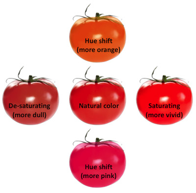
Now, let’s consider a given object—say a tomato. In general, our test source may modify the tomato’s color from its natural color in a number of ways. It may become more saturated (looking riper), less saturated (looking less ripe) or even change its hue (looking more orange or pink). A major goal of color rendition metrics is to quantify this kind of color shifts—in other words, to assign them values which correspond to our perception of color shifts.
 |
|
Figure 1: Depending on the light source, your tomato may look ripe or not. Or just look like a persimmon! Each of these shifts from the natural color corresponds to a reduction in color fidelity. (All photos courtesy of Soraa) |
In particular, you might want to know if the colors under the test source are different from natural colors—an important concept called color fidelity. Fidelity metrics work as follows: they consider a collection of test samples and for each, compute the difference between the sample’s natural color and the color under the test source. The larger the color differences, the lower the fidelity score.
Therefore, a high fidelity score tells us that perceived colors are very close to natural colors, whereas a lower score tells us that some color shifts occur. However, fidelity metrics don’t discriminate between various kinds of color shifts: referring to the figure above, all four shifts may “cost” an equal number of fidelity points (if they are of equal magnitude), despite corresponding to very different perceptions! Therefore, it’s easy to know what a high fidelity score means, but as soon as the score gets lower all bets are off: any kind of color shift may happen. That’s simply the price to pay for trying to describe a light source with only one number: lots of information gets lost!
The CRI happens to be a well-known example of a fidelity metric. As such, it suffers from two issues. The first, which is unavoidable, is that it only answers a specific question (“Are colors the same as natural colors?”), but is often expected to have a broader meaning (such as “Will colors look the best?”). You just can’t convey too much with one figure.
The second is that the CRI is not especially good at doing its job. It uses obsolete color science, which makes inaccurate predictions. It also uses a set of eight pastel test samples, with the expectation that these are representative of the variety of objects in our environment (a flaw we sometimes try to remedy by adding more samples, like the deep-red R9). Because of all this, the fidelity predictions of the CRI can be inaccurate. Namely, two sources may get the same score although one actually causes more color shifts—for instance, for a same CRI of 80, a narrow-band fluorescent lamp tends to distort colors more than an LED lamp. Ever wondered why you hated your CFL?... More troubling, it is possible to design some narrow-band sources having large color distortion but a very high CRI.
 |
|
Figure 2: The eight test samples of the CRI Ra. |
I don’t want to make the CRI sound worse than it is. For smooth spectra, a high CRI score is a meaningful thing—this is why we felt good using it to design our Vivid series! However, the CRI breaks down for lower scores (it doesn’t tell us what’s happening to colors), and for narrow spectra (it can be inaccurate).
All this brings us to TM-30. Why is it better than the CRI? There are two reasons. For one thing, it uses state-of-the art color science and an optimized test of ninety-nine color samples, to preclude the predictions error found in the CRI. All this new science is hidden under the hood—it’s exciting though, and I hope to talk more about it someday. Second, TM-30 gives us a lot more information: in addition to the color fidelity index (called Rf, in analogy with the CRI Ra) there is now a color gamut score Rg and a color vector graphic which give a lot more insight regarding color shifts. Come back here next week—I will explain in more details what these new metrics mean.


