Color vision begins with light. A single cone photopigment molecule absorbs a photon, initiating a series of actions that leads to isomerization, the transformation of one molecule into another molecule. Cone photoreceptors in the human retina are responsible for our perception of color and classified by the wavelengths of light to which they are sensitive: long (L), middle (M), or short (S). The cone photoreceptor sensitivity is determined by its likelihood that it will absorb a particular wavelength of light. For example, an S cone will more likely absorb blue light than an L cone.
 |
|
(Image: Lighting Research Center) |
Two key physical properties of light participate in color vision: wavelength and power. They factor into a light source’s spectral power distribution, which describes the amount of light power at each wavelength in the visible spectrum (which ranges from approximately 380 nanometers to 780 nanometers) that is emitted by that particular source. Power is a measure of the amount of light from each wavelength that arrives at a defined location per unit time.
As far as photoreceptors are concerned, however, wavelength and light levels are interchangeable. In other words, individual photoreceptors are “blind” to wavelength, and isomerization is the same regardless of the absorbed photon’s wavelength. Because how a photoreceptor counts photons and the number of isomerizations that occurs depend on both properties—that is, the probability of photon absorption (light wavelength) and the number of photons reaching the photoreceptor (amount of light)—changes in the rate of photon absorption by the photoreceptor could result from variations in either the wavelength or the amount of light.
For this reason, the assignment of color to any physical wavelength is erroneous because it implies that the colors we see are properties of a given wavelength. As Mark Rea, a professor at Rensselaer Polytechnic Institute’s Lighting Research Center (LRC) and an expert in color vision, has often said, “Color is a pigment of our imagination.”
 |
|
(Diagram Source: Scholarpedia.org/article/Color_vision) |
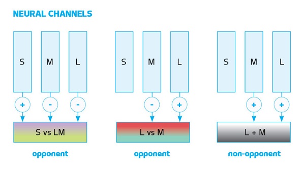
Once a photon is absorbed by the photoreceptor, processing occurs in the retina, and the neurochemical signals resulting from the isomerizations are recombined in the retina’s bipolar cells into three neural channels. One of those channels (L plus M cone responses) is achromatic. The other two are color-opponent chromatic channels: the blue versus yellow, or b–y (S cone – [L plus M] cone responses); and red versus green, or r–g (L minus M cone responses). The achromatic channel, which responds to variation in light and dark, is also referred to as a luminance channel. The chromatic channels are spectrally opponent, which means that responses to one color subtract from the responses to the other color. Opposite opponent colors are never perceived together—that is, we cannot perceive greenish-red or a yellowish-blue color. We see “white” when the L cone and M cone inputs are equal, and therefore, no hue information is generated by the bipolar neurons. When the net-sum signal from the L cone and the M cone is positive, the bipolar neuron signals red; when the net-sum signal is negative, the bipolar neuron signals green. This spectrally opponent information is passed onto the ganglion cell layer and then transmitted to the brain for processing.
Nonvisual Effects of Colored Light
As color is thus a visual perception and not a physical property, a discussion on colored light’s nonvisual effects might seem inconceivable. But the nonvisual effects of colored light can nonetheless be described as the impact of narrowband light stimuli on the retina that evokes responses in the brain’s neural channels independent of vision. One of the most studied nonvisual responses to light is the circadian system. The 24-hour light–dark patterns incident on the retina control the timing of the body’s biological clock, which generates and regulates our circadian rhythms so that we are awake during the day and asleep at night. In the absence of external cues, our circadian rhythms run on a slightly longer cycle of about 24.2 hours. We require daily exposure to morning light to reset our biological clock and keep us synchronized, or entrained, with a particular time zone.
To promote entrainment, researchers generally recommend exposure to circadian-effective light during the morning, and reduced exposure during the evening. This is because, unlike the visual system, which essentially responds in similar ways to the same light stimulus at any time, a given light stimulus will have different effects on our circadian rhythms when applied at different times of day. For example, light exposures experienced in the morning can advance the circadian system’s phase and result in earlier sleep and wake times. On the other hand, if experienced in the evening, light can delay circadian phase and result in later sleep and wake times. Given that our circadian clock runs on a 24.2-hour cycle, it needs to be advanced daily; therefore, to maintain entrainment, we need to be exposed to morning light.
As tunable lighting systems become more prevalent, this guideline typically manifests in the use of color temperatures of 5000K to 6500K during the day, and 2700K or less in the evening. While these rough recommendations are a good start, it is important to consider that in respect to white polychromatic light, varying the spectrum from 6500K to 2700K will increase the circadian effectiveness of the system, but not by very much. It is also important to specify the minimum amount of light needed for activating the circadian system. In general, the circadian system is less sensitive to light than is the visual system. The LRC has shown in many of our field studies that light levels in the built environment are at or below threshold for activation of the circadian system. This can have at least two health consequences: First is that people may not be getting enough morning light to promote entrainment; second is that exposure to low levels of circadian-effective light during the day may increase the impact of evening light, including those coming from bright, self-luminous displays.
 |
|
(Image: Lighting Research Center) |
When thinking about light level and spectra, however, think beyond white light. For example, if you choose to use desktop lighting that delivers 30 lux of a saturated blue light (peak wavelength = 470 nanometers) at a user’s cornea, the impact on the circadian system would be similar to delivering 400 lux of a 6500K source, or 550 lux of a 2700K source, at the cornea. So, while tuning the spectrum to deliver a more bluish white light would be energy efficient, the use of a saturated blue color light would be more than 10 times more effective for delivering the same level of circadian stimulation to the user.
Another less understood, but no less important, nonvisual effect of light is its impact on alertness. In this context, alertness, a construct associated with high levels of environmental awareness, is regulated by the interplay between the circadian timing system (a circadian process) and the duration of time awake (a homeostatic process). The circadian process is regulated by the endogenous circadian pacemaker, which, as noted above, is synchronized daily with the environment by the 24-hour light–dark patterns incident on the retina. In diurnal species, the circadian process promotes alertness during the day and sleep at night. The homeostatic process, on the other hand, accumulates sleep pressure as the number of waking hours increases.
In most studies to date, the light’s alerting effects have been linked to their ability to suppress melatonin, a hormone produced at night and under conditions of darkness. It is now well accepted that the circadian system, as measured by acute melatonin suppression, is maximally sensitive to short-wavelength (“blue”) light, but not long-wavelength (“red”) light. In other words, light suppresses melatonin and fools the brain into thinking that it is daytime, when one is expected to be alert. Recent studies conducted by the LRC, however, have demonstrated that, relative to darkness, exposures to both short-wavelength (saturated blue colored) and long-wavelength (saturated red colored) lights increased objective measures of nighttime alertness, but only the short-wavelength light suppressed melatonin.
These findings suggest that acute melatonin suppression is not needed for light to affect alertness at night, and are consistent with studies measuring the effects of daytime light exposure on brain activity using functional magnetic resonance imaging. White polychromatic and short-wavelength light exposures have been demonstrated to increase measures of alertness during the daytime, when melatonin levels are low. Corroborating that research, the LRC’s studies also demonstrated that saturated red light had a strong effect on objective and subjective measures of alertness, with that effect appearing to be stronger during the daytime, and especially during the afternoon decrement in performance known as the post-lunch dip.
One line of research that we at the LRC are currently pursuing is the impact of saturated red light in combination with ambient white polychromatic light. We are also beginning a series of studies to look at the brain mechanisms associated with these acute alerting effects of saturated light colors.
How to Use Saturated Colored Light
With the growing ubiquity of tunable lighting systems over the past decade, lighting designers have grown so accustomed to thinking about light levels and spectra that it has perhaps become easy to forget the other options available to promote circadian entrainment and alertness. So, how can we begin to think beyond ceiling-mounted tunable lighting systems?
A good place to start might be to take a step back and return to thinking about filling spaces with layers of light. This would be beneficial not just for visual performance and energy efficiency, but also in how layered light might contribute to entrainment and alertness. And here, it is crucial that vertical illuminance (light at the cornea) and not just horizontal illuminance (light on the workplane) be considered, because it is the light at the cornea that stimulates the circadian system. Delivering stimulus to the eye can be as simple as sitting next to a window, or as elaborate as installing desktop-mounted, self-luminous LED light panels. But the light does not have to come from the ceiling. If you choose to use ceiling light fixtures, make sure the distribution of light is such that the ratio of horizontal to vertical illuminances is at least 7:10.
 |
|
(Image: Lighting Research Center) |
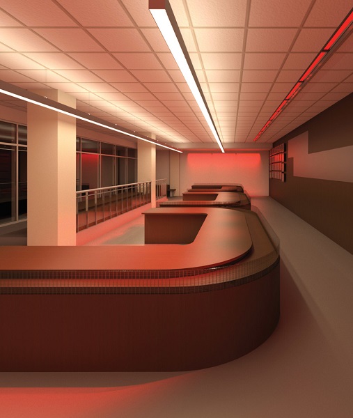
For example, in order to promote alertness and circadian entrainment in the early part of the day, a strong dose of circadian-effective light could be administered using an LED panel that emits a saturated blue (470-nanometer) light at eye level. On the other hand, to promote alertness after the post-lunch dip, an analogous saturated red (640-nanometer) LED panel could provide a stimulus that would be akin to a cup of coffee. Or, if that particular design were deemed to be impractical or infeasible, a simple red or blue light box could be installed. Another option is to set aside a portion of the space as a “light oasis,” to which users would come and obtain their circadian dose during the morning hours.
Also at play are the issues of timing and duration. Discussions of circadian-effective lighting design can sometimes focus on light spectra and levels at the expense of other key, coequal factors that are involved with light and the circadian system—namely, the timing and duration of light exposures and an individual’s personal history of such exposures.
In conclusion, while tunable lighting systems provide a dynamic lighting solution that create an aesthetically pleasing environment for users, when it comes to circadian-effective lighting, layers of saturated colored lights delivered at the plane of the cornea, rather than white light coming from the ceiling, may provide a more energy-efficient, comfortable, cost-effective, and aesthetically pleasing design solution. So, use the pigment of your imagination and think colored light in your next design.
(The article is written by Mariana Figueiro and it originally appeared on the 2017 Sept/Oct issue of Architectural Lighting. Mariana Figueiro, FIES, is a professor at the Lighting Research Center at Rensselaer Polytechnic Institute, where she also directs the Light and Health program. She is currently the center’s acting director while Mark Rea is on an academic sabbatical through June 2017.) 


