Communicating does not appear too difficult. There are many devices available to send data to everyone. The biggest challenge is to get the right information to the right person. In the last decades technology provided many new ways of communicating this field. With digital screens and mobile devices an overload of data is presented to the receiver, hoping the receiver picks up the right piece.
With signage we see the same issues. Big offices, hotels, convention centers, airports, all have different ways of trying to help the guests to find the meeting room, restaurant or gate. Digital technology has changed the field, but did it help?
I am not the expert on what kind of information is needed, nor the expert on wayfinding. What I have learned from all my meetings with end users, architects and users: there is an opportunity where our technology might have some answers….
One of the problems is the fact that the information or guidance we need is cluttered by the information we do not need. This means that we are distracted, confused even with information overload. Only showing relevant information at the right moment would improve the situation.
Another challenge is the location. We use the vertical plain to communicate. A screen, signs hanging from the ceiling, a pole with arrows, etc. At some locations you can see flooring that is used to guide people. Using colors, lines, different materials because people have a tendency to follow the path set out for them.
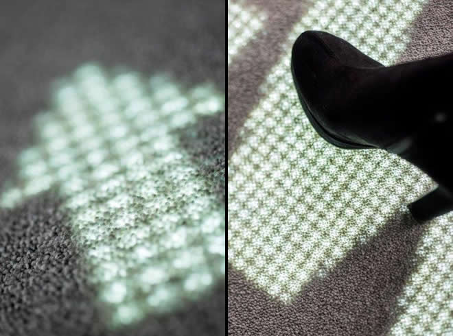
Luminous Carpets is providing building blocks to link to both ideas. One is that the solution is programmable and can be used to only show right information at the right time. And if you don’t have information to share, it is invisible, not cluttering. The location is the second key element of this communication tool. We use the floor. People have a tendency to look at the floor when walking. Not only because they are looking at their smartphone, but also because they do not want to trip or step on something. Using dynamic lighting ensures people will pay attention to the message, the directions or other info.
 |
|
|
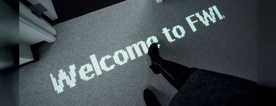
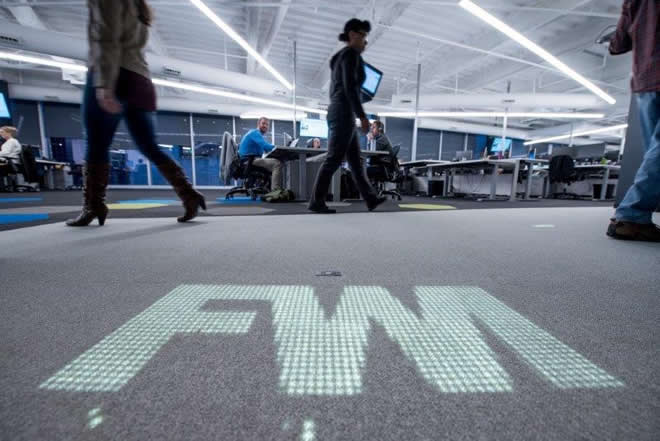
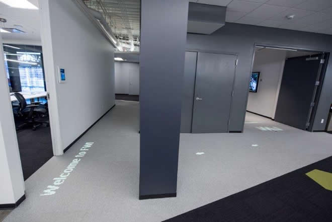
Together with Four Winds Interactive, an expert on digital communication we designed a solution for their office to showcase the possibilities of Luminous Carpets. Entering the office you will be first confronted with the animated logo of FWI, to make sure guests know where they are. The guests are then guided to the meeting room with animated arrows, where they are personally welcomed at the entrance.
We believe in partnerships. Getting the right companies and people at the table to design the experience and the best solution. FWI is our partner for North America and maybe even beyond. We offer the innovative building block, FWI will improve your customer and guest experience.


 CN
TW
EN

