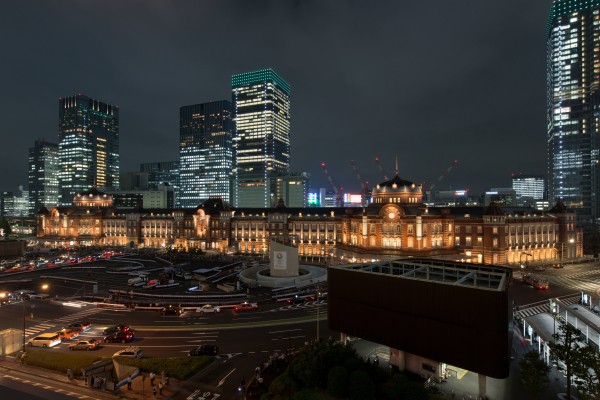
Surrounded by modern high-rise cityscape, the 100-year old, red-brick building, Tokyo Station stands out for its historical value. Recently preserved and restored, it is not only a historical railway station located near the Imperial Palace grounds and the Ginza commercial district, but also the busiest station in Japan.
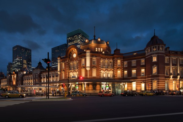
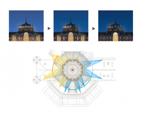
In the middle of a busy city, the Tokyo Station north-south elevation runs 400 meters long, featuring a dome at each end. Both domes are carefully illuminated from eight positions creating a symbolic 360°feature of the design.
-

-
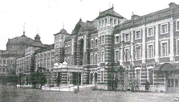
An old paint of Tokyo Station
Photo credit: Shashin Tsūshin January 1915 issue
-

-
Tokyo Station with new lighting by LPA.
Photo credit: Lighting Planners Associates/ Toshio Kaneko
A Brief History of Tokyo Station
Opened on December 20, 1914, the three-story station building was originally designed by architect Tatsuno Kingo (辰野 金吾). During World War II, the Bombing of Tokyo (also “firebombing”) caused extensive damage to the Tokyo Station building, shattering the domes that adorned the rooftops of the building. Angular rooftops intended to be temporary replaced the domes, but remained until the renovations. The Marunouchi (丸の内) side underwent an five-year renovation which was completed in October 2012 and was restored to pre-war condition.
In order to have the historic value of Tokyo Station be well-appreciated, the lighting concept “Harmonious Environment” intends to create a natural and friendly lightscape. Walking in this busy commercial district, one can easily feel overwhelmed by the brightly-lit high-rise buildings. Tokyo station, however, is like a pleasant haven in the city and calms the commuters’ minds. This is to thank for the detailed lighting strategy.
Five Lighting Strategies
To illuminate this old and elegant train station, lighting designers from Lighting Planners Associates (LPA ) introduced five lighting design strategies:
1. A Vista of Light and Shadow
2. Gradation of Light
3. Materials vs. Light
4. Sustainable Lighting System
5. Operations for Sustainability and to create a pleasant atmosphere
-

-
Photo Credit: Lighting Planners Associates / Toshio Kaneko
These five strategies makes Tokyo Station an elegant building which is friendly to our enviromnemt.
1. A Vista of Light and Shadow
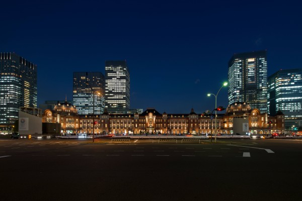
LPA made several studies and mockups to find the perfect balance between light and shadow for the 360 meter long elevation. The most attractive luminance ratio was decided on Central Area (A): North/South Domes (B): North/South Buildings (C): General Areas (D) = 7:10:5:3.
-

-
Image credit: Lighting Planners Associates
-

-
Photo credit: Lighting Planners Associates/ Toshio Kaneko
Seeking the right level of contrast along the façade and after countless studies, designers concluded the most attractive luminance ratio is Central Area: North/South Domes: North/South Buildings: General Areas= 7:10:5:3.
2. Gradation of Light
Strong contrast of light and shadow is necessary, but a softer approach is also needed. Methods were studied to create a gradation of light from ground level to the building top.
-

-
Photo credit: Lighting Planners Associates/ Toshio Kaneko
The above photo is a view of the heavily used north-south concourse. The lighting along this façade is a striking design to reinforce its function. The historic structure has lighting design constraints, but is artistically lit with a gradation of light from the bottom up.
3. Materials vs. Light
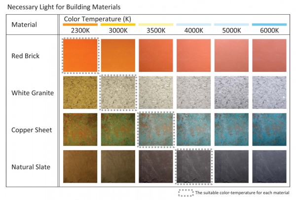
Red brick, white granite, copper sheet, and natural slate are the four main façade building materials. Aesthetically, each requires a different color temperature and is illuminated accordingly. A gradation of light staring in the warm range illuminates the building from ground level and up. We requested 2200K light to partially illuminate hotel guestrooms and gallery drapery from dusk, as an interior element of the façade lighting.
-

-
Image credit: Lighting Planners Associates
4. Sustainable Lighting System
The design aimed for high quality lighting with an energy efficient solution. All the light fixtures are LEDs for reducing the running and maintenance costs. Electrical consumption was reduced by 56% comparing to pre-renewal.
5. Operations for Sustainability and to create a pleasant atmosphere
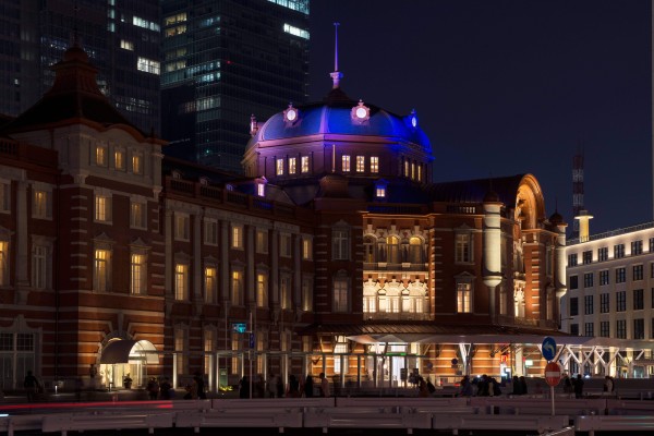
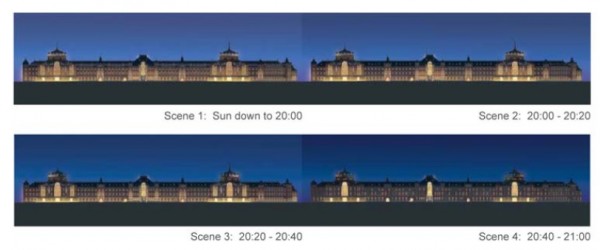
The design included a time-controlled system to dim the light appropriately, making subtle light transition and energy conservation possible. From dusk to light-on, there are four scenes changing and the lights are programmed to gently fade-out. The dome is carefully illuminated from eight different points. Blue light softly shines on the dome, simulating moonlight and a shift from dusk to night.
-

-
Image credit: Lighting Planners Associates
-

-
Image credit: Lighting Planners Associates
-

-
Blue light softly shines on the dome, simulating moonlight and a shift from dusk to night.
Photo credit: Lighting Planners Associates/ Toshio Kaneko
-

-
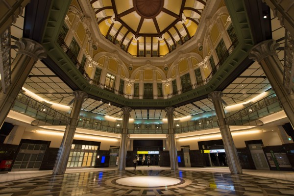
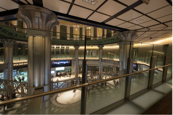
The dome is also viewable from a 2nd floor gallery and 3rd floor hotel guestroom windows. Glareless fixtures are used for a viewer-friendly design.
Photo credit: Lighting Planners Associates/ Toshio Kaneko
-

-
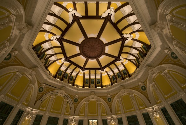
Inside of the dome.
Photo credit: Lighting Planners Associates/ Toshio Kaneko
Inside, LPA carefully illuminated the ceiling, walls, and relief work. Floor lux levels are reduced, but the dome up light creates a bright atmosphere and a central spotlight creates a focal point of light and emphasizes the shape of the dome. Also, lighting focuses on entrance, exits, ticket-vending machines, and ticket gates to clearly identify the flow of traffic. Dome lighting is 5000K During the day and is reduced to 3000K after dusk.
Above all those parts, the train station building is lit up with six main lighting items: Red brick wall illumination, relief work up light, main arch illumination, dome roof up light, linear lighting along roof line, window lighting.


